The Wu-Tang Clan Symbol: How a Kung Fu Bat Became Hip-Hop’s Most Iconic Logo (Design + Culture History)
The Wu-Tang Clan symbol — that bat-winged yellow W burned onto every hoodie, mixtape J-card, dorm-room poster and Nike bootleg since 1993 — got drawn in a single overnight session, for four hundred dollars, on the desk of a Staten Island teenager named Ronald Bean. He didn’t know it was a logo. He thought he was drawing a flyer.
Thirty-plus years later that flyer is one of the most recognized graphic marks in music, period. Nike had to lawyer up over it. Supreme put it on a box logo tee in 1997 before Supreme was Supreme. And it’s been more-bootlegged than any other emblem in hip-hop — not because the bootlegs weakened the mark, but because they built it. This is the full design and cultural history of the Wu-Tang Clan symbol: who drew it, what it actually means, how it turned into a merch empire, and how to tell a real one from a fake in 2026.
Mathematics, One Night, and the $400 Fee: How the Wu Symbol Was Actually Drawn
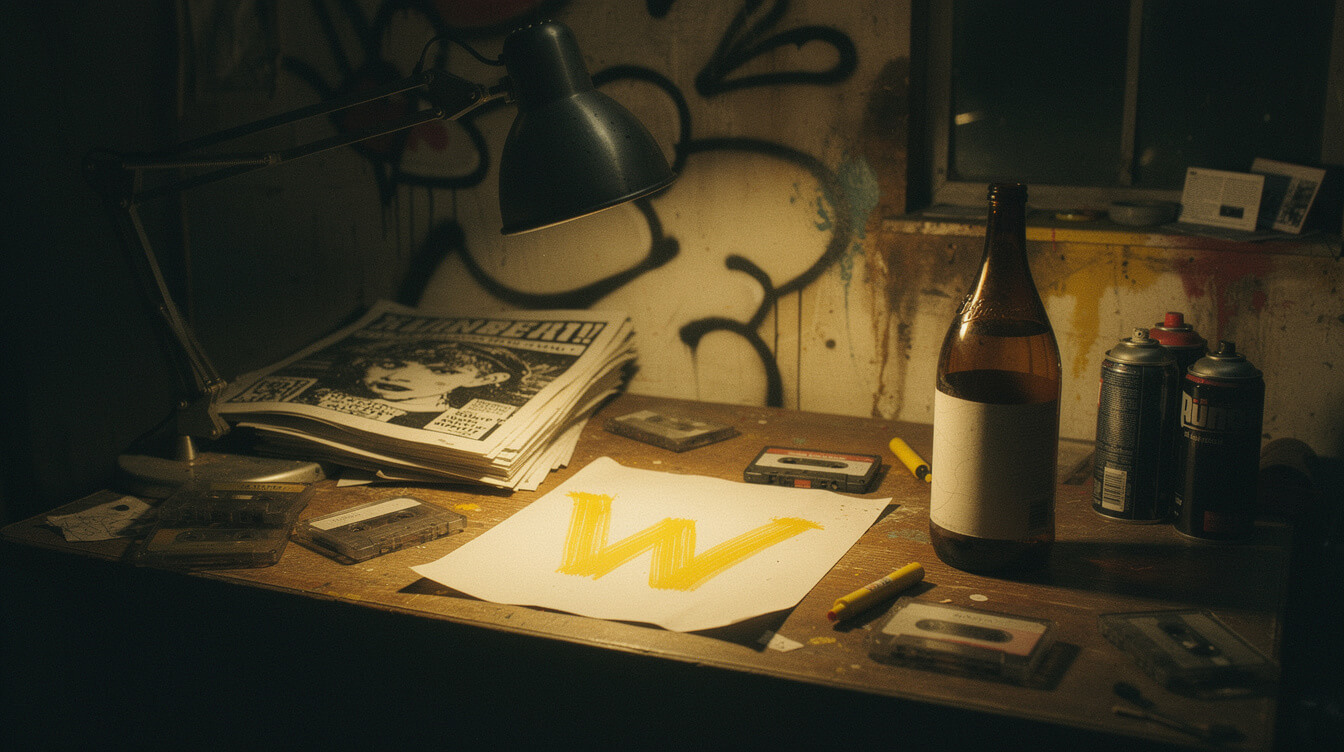
The credit goes to Allah Mathematics — government name Ronald Bean — a teenage DJ and graphic artist from Staten Island who was part of the RZA’s orbit before the Clan was even the Clan. In 1992, RZA (then still going as Prince Rakeem) needed a flyer for a group show. He didn’t have a logo. He didn’t have a budget. He had four hundred dollars, an idea, and the deadline of the next flyer print run.
Mathematics has told this story in interviews for decades — including a well-known sit-down with Complex and repeated in RZA’s own The Wu-Tang Manual. The commission was small, the turnaround was overnight, and the design was drawn by hand at a desk in Staten Island. No agency. No moodboard. No pitch deck. The reference points RZA gave him were simple: kung fu, mathematics, and a bird that swings like a bat.
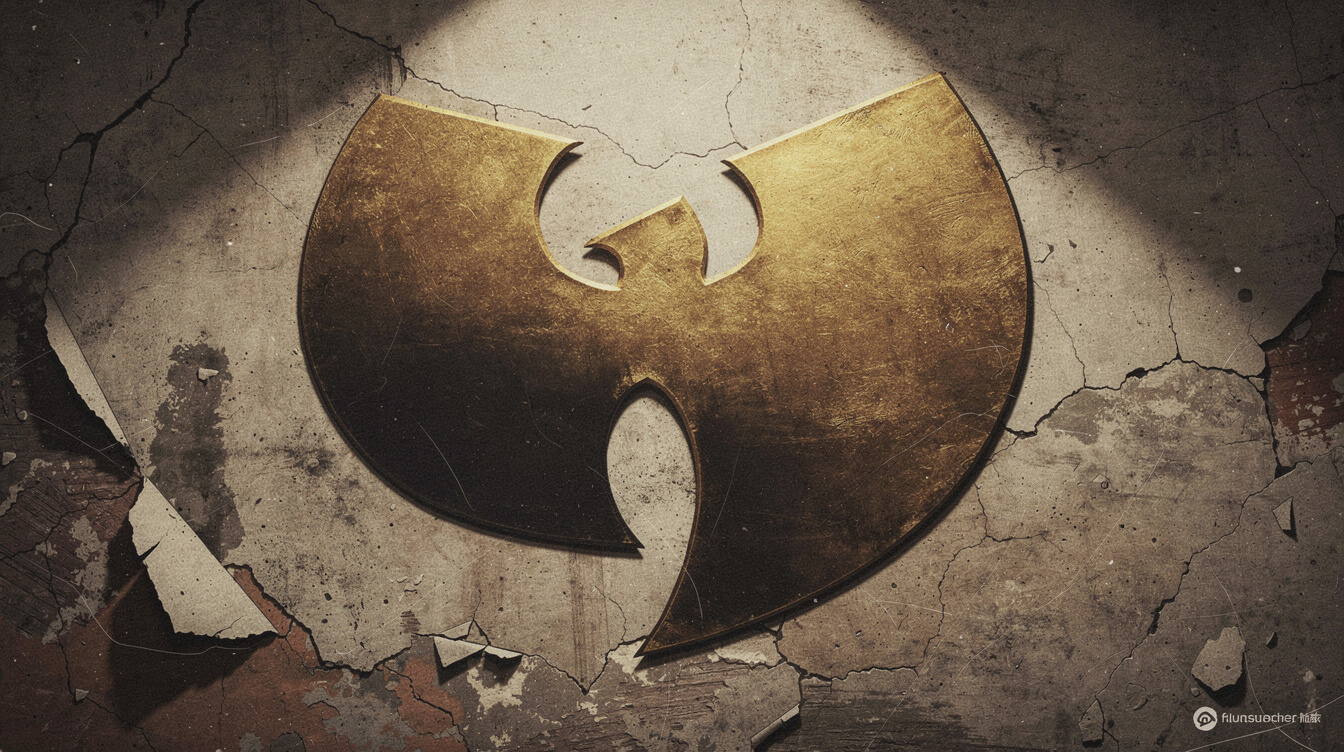
What Mathematics produced was a heavy, cleanly proportioned W built like a wing — two upstrokes and one hard downstroke that read equally as a bird in flight and a hooded silhouette. Under the W sits a disc, which reads at once as a shuriken, a vinyl record, and a compass. Yellow-on-black — the color palette non-negotiable, straight out of RZA’s Shaw Brothers obsession. It hit the flyer, the flyer hit the streets, and by the time Enter the Wu-Tang (36 Chambers) dropped in November 1993, the symbol was already the group’s identity.
The $400 fee is the receipt that matters. Mathematics didn’t own the mark. The Clan did — collectively, per the Loud Records deal. He was paid for the work and moved on. Only later, after the logo had been reproduced hundreds of millions of times worldwide, did the culture start to acknowledge the design credit properly. Mathematics went on to produce for the Clan (his beats sit under some of Ghostface’s and GZA’s sharpest work) and now DJs Wu-Tang tours globally, but the mark he drew in one night is still the calling card. That’s a wild success rate for a $400 gig.
Reading the W: 5 Percenter Mathematics, Killa Beez Swarm, and the Bat Wings
The W is not just a letter. It’s an encoded symbol, and its meaning runs through the Five Percent Nation — the Nation of Gods and Earths — where RZA, GZA, and most of the founding Clan came up spiritually. In the Supreme Mathematics of the Five Percent, letters and numbers carry doctrinal weight, and the W sits on a stack of readings that the group has never spelled out in a single interview but that any reader of RZA’s writing recognizes on sight.
Read one way, the W is Wisdom — the second degree in Supreme Mathematics, which corresponds to the number 2. Read another way, it’s the seventh letter of the Arabic alphabet (waw), and the number 7 is God’s number in Supreme Mathematics — the number that gives you access to Wisdom, Strength, and Beauty as a triangle. RZA’s stage-name numerology, the constant returning to the number 7 across the discography, the “Triumph” chorus counting through the degrees — these are not accidents. The W was chosen because it holds the doctrine.
Read a third way — the visual, tactile way — the W is bat wings. The bat is a night creature that sees in the dark, which is exactly the self-image the Clan built: sound in the shadows, seeing what others miss, moving as a swarm. RZA has publicly described the Clan’s collective identity as a “Killa Beez” swarm — solo careers orbiting a hive, all wearing the same insignia. The bat-winged W is the swarm’s colors. Every solo LP that dropped between 1994 and 1999 — Method Man’s Tical, Ghostface’s Ironman, Raekwon’s Cuban Linx, GZA’s Liquid Swords — used a variant of the W somewhere in the artwork or the label. That’s the swarm.
The design pulls off a rare thing: it works as a literal letter, a doctrinal symbol, and a natural-world image all at the same time. You can teach a five-year-old the W and you can teach a scholar the theology and both readings hold. That’s what real semiotic weight looks like.
RZA’s Kung Fu Palette: Shaolin, the 36 Chambers, and the Design Language of Wu
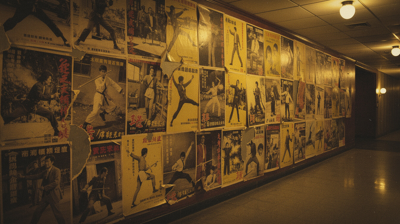
Nothing about the Wu-Tang design language makes sense without Shaw Brothers. RZA grew up on the Times Square 42nd Street grindhouse circuit, mainlining Hong Kong martial arts films — Gordon Liu, Lo Lieh, the entire Shaw Brothers catalog. The founding text is The 36th Chamber of Shaolin (1978). The album title Enter the Wu-Tang (36 Chambers) is a direct sample of that world, and so is the visual identity.
The yellow-and-black color palette isn’t a design decision. It’s a citation. Shaw Brothers used a specific saturated yellow — the color of the Shaw Brothers title cards themselves — against deep matte black in poster after poster from the 1970s. RZA and Mathematics lifted the palette wholesale, and the result is that the Wu logo doesn’t just refer to kung fu films; it visually is a kung fu film title card. Slap the W onto a black tee and you’re wearing a poster.
The disc under the W deserves its own paragraph. It’s a Shuriken (throwing star) at first read, which slots into the martial arts language. It’s a vinyl record on second read, which is what hip-hop is built on. It’s the bagua compass — the eight-pointed diagram in Chinese cosmology that governs directional energy — on the third read, and the eight points map to the eight founding members plus the ninth as center. It’s also, if you look at it long enough, an eye. That’s four functional readings from a single graphic element under the letter, and every one of them is doctrinally load-bearing for a Clan that was consciously building an origin mythology.
Compare this to the visual language of every other founding hip-hop crew and the Wu symbol is doing far more work. The Native Tongues had a family crest vibe. N.W.A. had a logotype. Public Enemy had the crosshairs silhouette — one of the great political marks in music — but it was a single reading. The Wu-Tang Clan symbol is a stack of readings all held in one shape. That density is why the mark still radiates in 2026 the same way it did on a 1992 flyer.

Bring the Shaolin Aesthetic Home
Our Wu-Tang Forever Neon LED sign locks the bat-winged W in the same saturated Shaw Brothers yellow. Handmade, low-heat LED, ready to run on any wall.
Wu-Wear 1995: The Merch Empire That Legitimized Rap Apparel
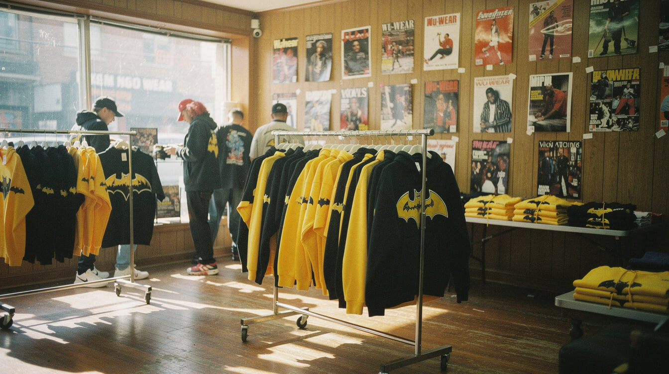
Two years after the logo debuted, the Clan did something no rap group had ever properly done: they built a real, retail-first, wholesale-distributed apparel brand around the mark. Wu-Wear launched in 1995 out of Staten Island, financed and run initially by Power (Oli Grant), RZA’s brother and business partner. The first Wu-Wear store opened on Victory Boulevard in Staten Island. The line hit shelves in mall chains like Macy’s, and Wu-Wear grew into a reported $10 million annual business by 1998 — real money, in real retail, with the bat-winged W on the label.
The context matters. In 1995, no rap group owned their apparel business. Artists licensed merch to third-party tour-merch companies and got peanuts. The FUBU / Karl Kani / Cross Colours black-owned streetwear moment was happening in parallel, but those were designer-first brands with rap adjacency. Wu-Wear was the first rap-group-owned apparel line to scale into national retail with the group’s own graphic identity. That is a structural first, and every rap-owned merch line that came after — from Rocawear to Sean John to G-Unit Clothing to modern Kanye and Travis Scott drops — inherits from that Wu-Wear template.
The line covered the full apparel spectrum: tees, hoodies, jerseys, denim, headwear, even Wu-branded fragrance and footwear at the peak. But the anchor was always the W on a black tee or hoodie. The Method Man CBS special that ran in the late ’90s featured the Wu-Wear line as a lifestyle brand, not a merch stand. The message was clear: this is a company, not a T-shirt table at a concert.
You can trace a direct line from Wu-Wear 1995 to the modern culture-native apparel movement — and to what we do at Custom Creative. Our full hip-hop apparel catalog — from the From the Slums of Shaolin Hoodie to the Mandingo Style Wu-Tang x Mathematics Tribute Tee — sits in that lineage. Culture-owned merch, made with respect for the mark, not a lazy screenprint chasing a trend.
Supreme x Wu-Tang 1997: The Collab That Rewired Streetwear
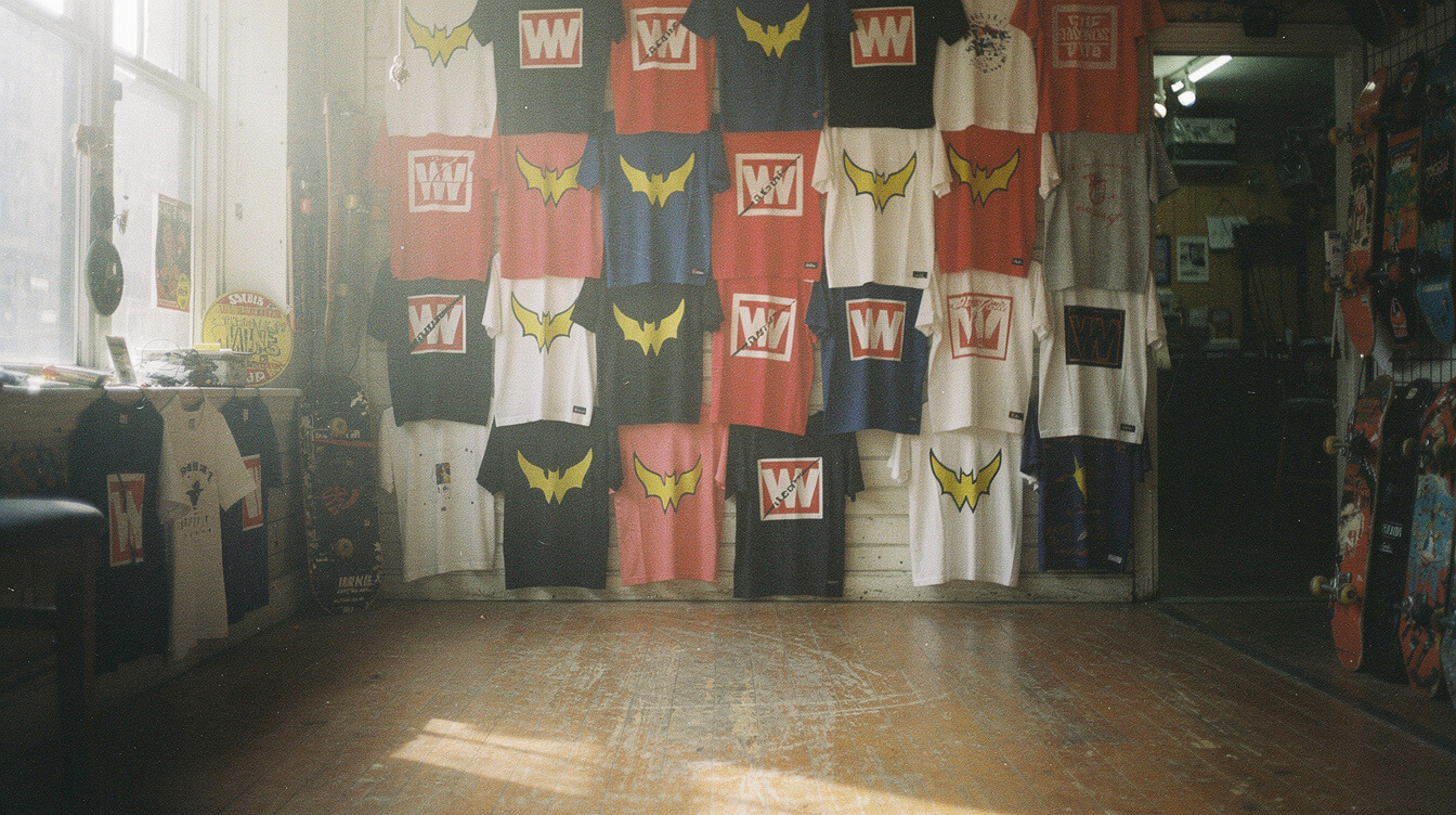
In 1997, Supreme was three years old, still a downtown NYC skate shop on Lafayette Street, still years away from being valued in the billions. That year they did a Wu-Tang collab: a boxed logo tee that swapped Supreme’s box for the Wu-Tang W treatment, plus a fitted cap and a hoodie in the run. It was tiny — a couple hundred pieces, sold in-store — and it barely registered in the streetwear press at the time. It is now one of the most sought-after items in Supreme’s back-catalog and routinely sells for four figures on resale.
What this collab did structurally is more important than what it sold for. In 1997, the concept of an “iconic streetwear collaboration” barely existed. The Nike SB Dunk era was still five years out. Fragment x anything was a decade away. Supreme x Wu-Tang predates the entire modern collab industrial complex, and it did the exact thing that later collabs would make famous: two culturally-loaded graphic marks fused into a single garment that carried both worlds at once. James Jebbia was reading the game correctly a decade before the game existed.
The Wu-Tang side of the deal is under-discussed in streetwear histories, which tend to be told from Supreme’s perspective. From the Clan’s side, this was a validation that the W had crossed over from rap-culture merch into the downtown-NYC design world. The same symbol that was moving out of Staten Island mall retailers was now co-signed by the store that dictated skate-scene taste. That kind of vertical bridge — from mall to underground — is how a graphic mark becomes generation-neutral.
Modern collab culture — from Rocky x Guess to Kaws x Uniqlo to Travis Scott x McDonald’s — is walking a path that Supreme x Wu-Tang cut in 1997. The Wu logo did it first, and it did it because the mark itself was strong enough to survive being placed inside another culturally-loaded frame without dissolving. Not every logo can do that.
The Bootleg Empire: Why the Wu-Tang Clan Symbol Became Hip-Hop’s Most-Copied Graphic Mark
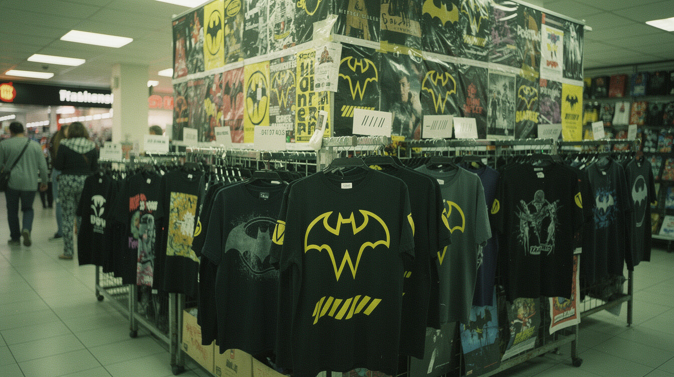
Here’s the story most Wu-Tang design pieces skip: the biggest engine of the W’s cultural reach was not Wu-Wear. It was the bootleg economy. From roughly 1996 through the mid-2000s, the Wu logo was the most-bootlegged graphic mark in hip-hop, appearing on unlicensed tees at every mall kiosk, tour parking-lot stand, dorm-room poster stack, screenprint shop, and swap meet from Staten Island to São Paulo. The Clan did not license most of it. They didn’t need to.
The Nike Air Force 1 “Wu-Tang” of 1999 is the most famous example. A design team at Nike prepared a Wu-branded AF1 colorway — yellow and black, of course — for regional release. The story goes that a small quantity actually made it to select markets before Nike killed the release. That “killed” run has since become one of the most valuable Air Force 1s in existence, with confirmed pairs trading in the mid-five-figures on the collector market. It is, functionally, a bootleg that Nike itself produced and then unproduced, which is a wild loop.
The mall-tee economy of the late ’90s and early ’00s put the W on the chest of tens of millions of teenagers who never bought a Wu-Wear piece and might not have owned a Wu album. And every one of those tees carried the mark forward. Bootleg dorm posters in college housing across the country turned freshman rooms into recruitment posters for the Clan. Every fake bag at the flea market with a wonky W on it advertised the real mark to a next-tier audience. Copyright lawyers hate this reasoning, but it is a fact of graphic-mark history: the Wu logo grew because it got copied, not despite it.
The reason the mark could survive the flood is that it is graphically strong. A wonky bootleg of a weak logo just looks bad. A wonky bootleg of the Wu W still reads as the Wu W — because the shape is that dominant. The bootlegs did not dilute the mark; they distributed it. The Clan’s legal team eventually locked down the biggest infringements, but the culture-level saturation was already done. This is a case study every design school should teach: sometimes the market saturates your logo faster than you can manufacture it, and that is not always a problem.
Spotting Real Wu-Tang Merch in 2026: What the Wu-Tang Clan Symbol Tells You
After thirty years of licensing, unlicensing, sub-licensing, collabs, bootlegs, tribute pieces, and estate deals, the question of what counts as a “real” Wu-Tang merch item in 2026 is genuinely non-trivial. The mark itself is the most reliable first tell. Here’s what to look for.
W proportions. The Mathematics-drawn W has a specific geometry: two vertical upstrokes with a slight inward taper, a hard V at the base, and a downstroke slightly wider than the upstrokes. Cheap bootlegs get the base V wrong — either too sharp or too round. The wings-under-the-W flare (that bat-wing curl on the outside of each vertical) is often missing or dumbed down on knockoffs. Real Wu apparel — whether from Wu-Wear era, the current Wu-Tang Brand LLC licensed run, or a properly-cleared tribute drop — preserves the geometry.
Color spec. Real Wu yellow is a specific saturated shade — closer to the Shaw Brothers title-card yellow than to a generic Pantone school-bus yellow. If the yellow looks pale, washed out, or drifts toward mustard, it is very likely a bootleg or an unlicensed print.
Tag / label. Licensed Wu apparel carries either the Wu-Tang Brand LLC label, the Rock Steady Crew license (for classic-era reproductions), or a properly-cleared collab label naming both parties. Unlicensed pieces usually skip the label entirely or have a generic mall-tee tag.
Provenance of the seller. The single fastest way to make sure you’re not buying a bootleg is to buy from a shop that respects the culture and the licensing chain — which is exactly the standard we hold ourselves to at Custom Creative. If the seller can’t tell you where the design came from, don’t buy the piece. Our complete Wu-Tang merch guide and definitive buyer’s guide break the current market down in more detail, including what to expect at each price point.

Shop the Real Thing
Our From the Slums of Shaolin hoodie honors the mark with correct W geometry, real Shaw Brothers yellow, and heavyweight cotton. Wear the swarm — not a bootleg.
Frequently Asked Questions About the Wu-Tang Clan Symbol
Who designed the Wu-Tang Clan logo?
The Wu-Tang Clan symbol was designed by Allah Mathematics (Ronald Bean), a Staten Island DJ and graphic artist affiliated with the Clan from the beginning. He drew it in a single overnight session in 1992 for a reported $400 commission from RZA, originally for a group show flyer. Mathematics has since produced tracks for the Clan and tours as their DJ.
What does the Wu-Tang Clan W symbol mean?
The W carries multiple readings at once. In Five Percent Nation Supreme Mathematics, W maps to Wisdom (2nd degree) and to the number 7 (God’s number). Visually, the W reads as bat wings — a reference to the Clan’s “Killa Beez” swarm imagery and their nocturnal self-image. It also functions as a literal letter W for “Wu.” The disc underneath reads as a Shaw Brothers-style shuriken, a vinyl record, and a bagua compass — one graphic doing four cultural jobs simultaneously.
Why is the Wu-Tang logo yellow and black?
The palette is a direct citation of 1970s Shaw Brothers kung fu film posters, particularly around The 36th Chamber of Shaolin — RZA’s foundational cinematic reference. Slapping the W on a black tee in that specific saturated yellow effectively turns the garment into a kung fu film title card.
Is Wu-Wear still in business in 2026?
The original Wu-Wear apparel company operated most actively from 1995 through the early 2000s and peaked at a reported $10 million in annual revenue. It has been relaunched and reissued in various forms since — sometimes as Wu-Wear proper, sometimes under Wu-Tang Brand LLC licensing — and the mark remains available on officially licensed pieces. Standalone Wu-Wear retail is not what it was in the ’90s, but the brand IP is still active.
What is the most famous Wu-Tang collab?
Historically, the 1997 Supreme x Wu-Tang capsule is the most-cited streetwear collab, and it now trades in the four-figure range on resale. Design-history-wise, the 1999 Nike Air Force 1 “Wu-Tang” — famously killed by Nike after limited regional release — is the most valuable single-piece collab, with confirmed pairs selling in the tens of thousands.
How do you spot a real Wu-Tang merch item?
Check three things: W geometry (the bat-wing outer flare and the hard V base), color spec (saturated Shaw Brothers yellow, not pale mustard), and tag/label (Wu-Tang Brand LLC, a proper collab license, or a shop that respects the licensing chain). If the seller can’t explain where the design comes from, treat it as a bootleg.
Final Thoughts: Why the Wu Symbol Still Radiates
Most logos die inside a decade. The good ones make it two. The Wu-Tang Clan symbol has now sat at the center of the culture for over thirty years, and shows no sign of cooling. That’s not marketing. That’s design working correctly. The mark holds because it’s stacked with meaning at every layer — letter, doctrine, animal, cinema, swarm — and because the Clan built a mythology around it that people wanted to opt into. That opt-in energy is the whole game.
Every real hip-hop mark since — from OVO’s owl to Yeezy’s mountain silhouette to Griselda’s tape-deck seal — is competing for the same job the Wu W does. Very few will do it as well. When you wear the mark, you’re carrying a lineage that starts on a Staten Island desk in 1992, runs through Shaw Brothers theaters and Five Percent lessons, past a Wu-Wear cash register in a Macy’s, into a Supreme dressing room, past a Nike lawyer, over a bootleg tee at a flea market, and lands on you. Stay in the swarm.
Stay creative — The Custom Creative Team
Get the Culture in Your Inbox
New drops, deep-cut culture writing, and first access to limited-run pieces. No spam, no filler. Just the real thing.

🎧 Never Miss a Drop
Exclusive product releases, hip-hop deep dives, and member-only discounts. Straight to your inbox.
Free forever. No spam. Unsubscribe anytime.
Get the Culture, Delivered
Deep dives into hip-hop history, exclusive product drops, and discounts sent straight to your inbox. No spam, just culture.
Join 2,000+ hip-hop heads already in the loop. Unsubscribe anytime.