Hip-Hop Artwork: A Complete Visual History From Subway Cars to Tracklist Tees
Hip hop artwork never needed a gallery wall to prove itself. It was already hanging — on subway cars rolling through the Bronx, on record store shelves wrapped in airbrushed chrome, on the back of a tour tee you bought because the tracklist alone told a story. The culture built its own visual language before anyone outside it was paying attention, and that language still runs through everything from a Griselda hoodie drop to a frameless glass print over somebody’s couch.
This isn’t a “best hip-hop wall art” roundup — that lane’s been run into the ground by the same ten Pinterest boards recycling the same six album covers. This is the actual lineage: who built the visual grammar, where it came from, and how it keeps mutating into things you can wear, hang, and live with.
What Actually Counts as Hip-Hop Artwork
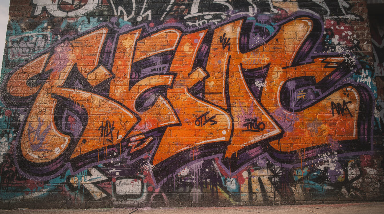
Say “hip hop artwork” to ten different heads and you’ll get ten different answers, and all ten are correct. It’s album covers, obviously — the gatefolds and cassette inlays that did half the marketing before a single was even a format. It’s graffiti, which predates hip-hop as a recorded art form but got pulled into the same cultural gravity well in the mid-1970s Bronx and never left. It’s flyers — the hand-cut, Xeroxed party flyers that DJ Kool Herc and Afrika Bambaataa’s crews passed out, which design historians now treat as a genre unto themselves. It’s tour merch, logo design, mixtape cover art, and increasingly, the typography-driven tracklist tee that’s taken over hip-hop fashion in the last decade.
What ties all of it together isn’t a single medium — it’s a shared instinct: take whatever’s cheap, fast, and available (spray paint, a photocopier, an airbrush gun, a screen-print press) and turn it into something that announces exactly who made it and where they’re from. That instinct is the actual throughline. Everything else is just the medium of the decade.
The Flyer Economy Nobody Credits
Long before a single album cover mattered, Bronx party flyers were doing the exact same job: announcing who was playing, where, and why it mattered, in whatever bold type a hand-cut stencil or a Xerox machine could produce. Buddy Esquire is the name design historians point to — his hand-lettered, photocopied flyers for late-70s and early-80s Bronx jams (documented extensively in Johan Kugelberg’s photo history Born in the Bronx) are now treated as the first real body of hip-hop graphic design, full stop. The budget was zero. The type had to work anyway. That constraint shows up in every era that follows.
The Album Cover Era That Started It All
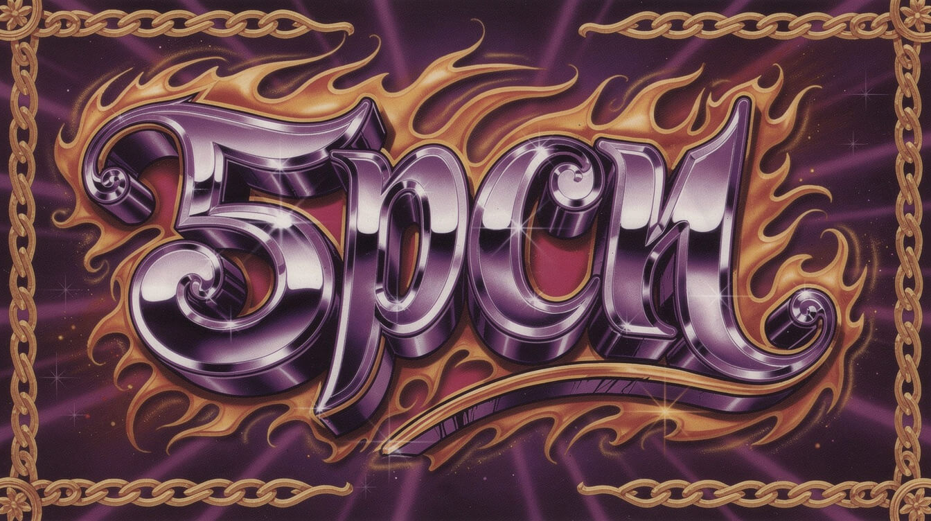
By the late 1980s, record labels understood that a cover had to do real work — it had to read at thumbnail size in a record store crate and still hit at full size on a wall. A handful of designers figured out how to do both, and their fingerprints are still the reference point for “hip-hop artwork” as a visual category.
Cey Adams is probably the most important name casual fans have never heard. In 1988, Adams co-founded The Drawing Board, the design studio that effectively became Def Jam’s in-house art department. He built the visual identity for LL Cool J, Run-DMC, and the Beastie Boys’ Licensed to Ill — the Rolls-Royce-grille cover that’s parodied constantly and still instantly recognizable decades later. Adams treated logos the way a tagger treats a signature piece: bold, legible from across the room, built to be reproduced on anything.
Eric Haze came up through the graffiti scene — his tag was literally HAZE — before moving into commercial design, and in 1993 he designed the Wu-Tang Clan’s “W” logo for Enter the Wu-Tang (36 Chambers), working directly with RZA. That logo is arguably the single most tattooed piece of hip-hop artwork in existence, and it came out of the same lettering instinct Haze developed writing on walls years earlier.
Then there’s Pen & Pixel Graphics, the Houston studio that gave No Limit Records and Cash Money Records their signature mid-to-late-90s look: airbrushed Lamborghinis, stacks of cash rendered like currency never actually looks, angel wings, and enough chrome lettering to blind you. It was maximalist, it was unsubtle, and it sold millions of records — proof that “tasteful” was never the assignment. The aesthetic was aspirational in the most literal sense: here is everything you could have, rendered large enough to see from the back of the store.
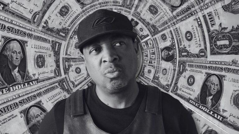
Not every classic cover needed to shout to make its point, though. Illmatic used a childhood photo of Nas superimposed over a Queensbridge housing project backdrop — intimacy instead of excess, and arguably just as influential. Paid in Full leaned into its title literally, surrounding Eric B. and Rakim with cash. Public Enemy’s It Takes a Nation of Millions to Hold Us Back put Chuck D and Flavor Flav behind bars, turning the cover into a political statement before the needle even dropped. Three completely different strategies, same underlying rule: the cover has to tell you what the record is about before you’ve heard a single bar.
Graffiti’s DNA Inside the Sleeve
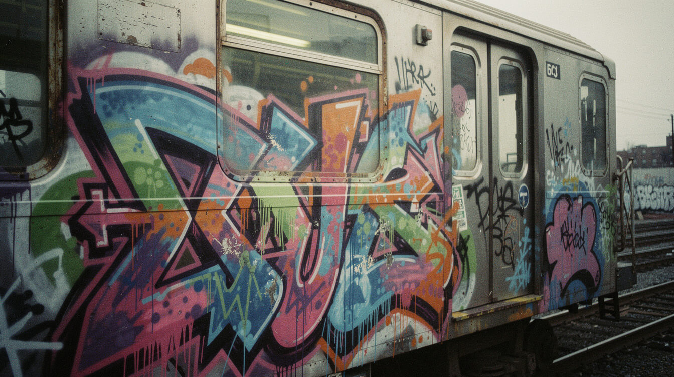
Before any of those album covers existed, graffiti had already written the visual rulebook: wildstyle lettering, interlocking letterforms, color separation, and the idea that your name — rendered big and loud enough — was itself the artwork. Dondi White, one of the most technically gifted writers to ever work a subway car, became a foundational figure the moment Style Wars (the 1983 PBS documentary) and Subway Art (the Martha Cooper and Henry Chalfant photo book published the following year) put his pieces in front of an audience that had never seen a train car as a canvas. Those two documents did more to codify “this is hip-hop’s visual culture” than any single album cover.
Fab 5 Freddy is the connective tissue most people skip past. He moved fluidly between the graffiti scene, the downtown Manhattan art world — he was close with Jean-Michel Basquiat — and the earliest hip-hop recordings, eventually hosting Yo! MTV Raps from 1988 to 1995 and introducing mainstream America to a visual culture it had been ignoring for over a decade. Basquiat himself has a direct hip-hop artifact: he painted, financed, and produced the cover art for “Beat Bop” by Rammellzee and K-Rob in 1983, a 12″ that’s now a five-figure collector’s item precisely because the art and the record are inseparable from each other.
The point isn’t that graffiti writers “influenced” album art from a distance. It’s that the same people were doing both — the letterforms on a train and the letterforms on a record sleeve came out of the same hands, the same training, the same instinct for scale and legibility under pressure.
“Wild Style” Made the Case on Film
If one document forced the crossover into the mainstream frame, it’s Charlie Ahearn’s 1983 film Wild Style, built around real graffiti writer Lee Quiñones and featuring Fab 5 Freddy. It wasn’t a documentary exactly, but it used real writers, real pieces, and real MCs to argue — visually, before any critic got around to saying it in print — that graffiti, breaking, DJing, and MCing were four expressions of one culture, not four separate scenes that happened to overlap. Every “four elements of hip-hop” explainer written since owes something to the case that film made on screen first.
Tracklist Tees and the New Typography Lane
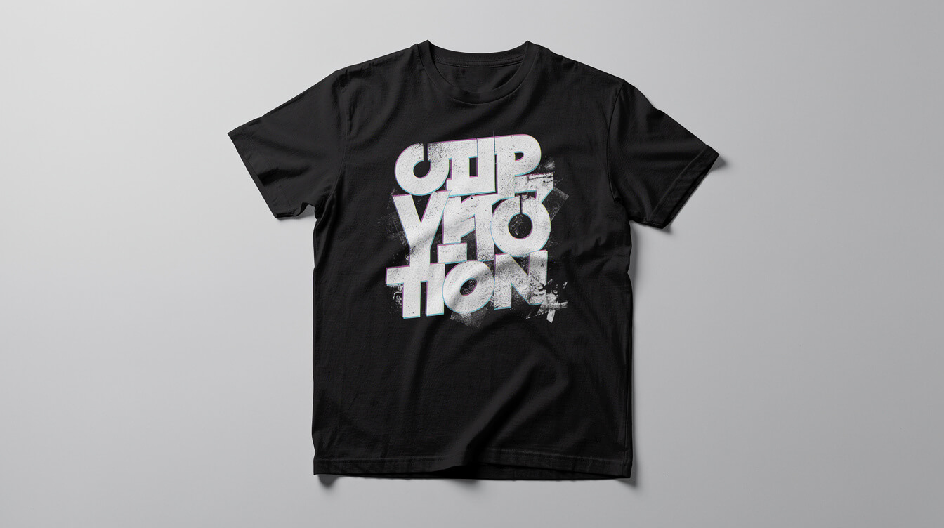
The newest chapter in hip-hop artwork isn’t hanging anywhere — it’s being worn. The tracklist tee, where an album’s full sequencing gets silkscreened across the back like a tour date list, has become one of the most consistent formats in hip-hop merch over the last decade, and it’s a direct descendant of the same design logic that built classic album sleeves: take the information fans already care about and render it as graphic art in its own right. A tracklist isn’t just metadata when you’ve memorized the transitions between tracks — it’s a map of the listening experience, and seeing it printed in bold type hits the same nostalgia nerve as flipping a gatefold sleeve.
You can see the same instinct at work in our Ol’ Dirty Bastard “Return to the 36 Chambers” Hoodie, which leans directly on the chaotic, lettering-forward energy of the original Wu-Tang sub-label aesthetic rather than just slapping a photo on fabric — the same principle Cey Adams and Eric Haze were working with thirty years earlier, just on a different substrate.
Typography-first merch is also where a lot of current hip-hop design talent is doing its most interesting work, because a tracklist or a quote has to be legible at both arm’s length and across a room — the exact same constraint that shaped 90s album covers, just solved with a Cricut and a heat press instead of an airbrush gun.
The Vinyl Revival Is Pulling This Trend Along
None of this exists in a vacuum from the vinyl collecting boom. Once you’ve bought a record specifically for the gatefold art and the liner notes, a tracklist tee isn’t really merch anymore — it’s an extension of the same collector instinct, just on fabric instead of cardboard. That’s part of why sequencing-as-design has stuck around as a lane instead of fading out as a one-season trend: it’s feeding the same completionist energy that drives someone to track down a specific pressing of a classic album.
Five Designers Worth Knowing by Name
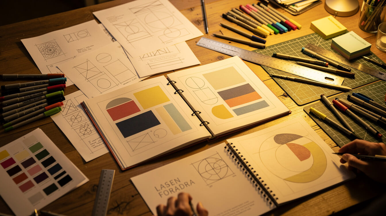
Hip-hop artwork has always had a credits problem — the MC’s name goes on the spine, the designer’s name goes nowhere. Here are five names worth actually knowing.
Cey Adams — Def Jam’s First Art Director
Covered above, but worth restating: Adams built the visual identity for an entire label at a moment when “hip-hop label” wasn’t yet a design category anyone had solved. His logo work for LL Cool J and Run-DMC is still being referenced in streetwear drops today.
Eric Haze — The Wu-Tang Logo
From tagging walls to designing the most tattooed logo in the genre’s history. Haze later built his own streetwear label, closing the loop between graffiti, album art, and apparel completely.
Pen & Pixel — The Houston Maximalists
No Limit and Cash Money’s signature 90s look. Unapologetically over-the-top, instantly recognizable, and still getting referenced (and parodied) in design circles decades later.
Dondi White — The Train Car Canon
The writer whose work in Style Wars and Subway Art gave hip-hop’s visual culture its first widely-seen, widely-studied body of work, years before most labels had a dedicated art department at all.
Fab 5 Freddy — The Bridge
Not primarily a visual artist himself, but the person who physically connected the graffiti scene, the downtown art world, and hip-hop’s earliest recordings into one continuous culture — then put it on television.
Along similar lines, if you’re into the merch side of this conversation, our pieces on the Westside Gunn merch aesthetic and the Freddie Gibbs album-era wardrobe guide trace this exact same lineage into modern independent hip-hop, where artists are building their own in-house visual identities the way labels used to.
Framing It: Turning Album Art Into Wall Art
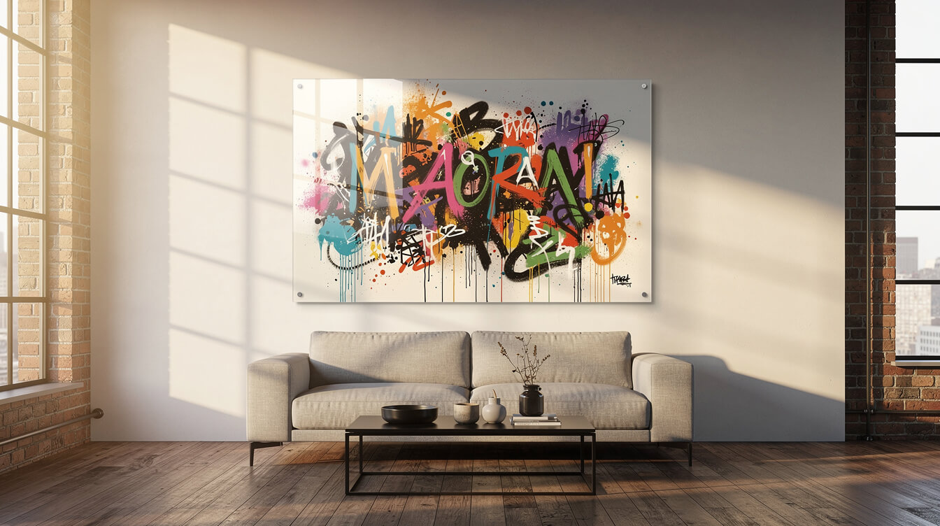
Here’s where hip-hop artwork’s biggest contradiction shows up: this is some of the most visually ambitious design work of the last fifty years, and almost none of it was ever meant to hang on a wall. Album covers were built for a 12-inch square or a 5-inch jewel case. Graffiti was built to be temporary by definition — buffed, painted over, gone within weeks. None of it was designed for permanence, which is exactly why turning it into something you can actually live with takes real intention, not just a frame from a big-box store.
That’s the gap our SpectraGlass™ HD Frameless Glass Print is built for — it takes high-resolution artwork (your own photography, a custom design, anything with real detail worth preserving) and renders it on frameless glass with the kind of depth and color saturation a flat poster print just can’t touch. If the artwork that shaped this culture deserves better than a thumbtack and a dorm wall, this is the upgrade.

Put the Culture on Your Wall, Not Your Phone
SpectraGlass™ HD turns any high-resolution design — street art, album art, your own photography — into a frameless glass panel with real depth and color. No frame, no glare, just the art.
Frequently Asked Questions About Hip-Hop Artwork
Who designed the Wu-Tang Clan logo?
Eric Haze, a graffiti writer turned graphic designer, created the “W” logo in 1993 for Enter the Wu-Tang (36 Chambers), working directly with RZA. It remains one of the most reproduced and tattooed pieces of hip-hop artwork ever made.
What is Pen & Pixel known for?
Pen & Pixel Graphics was the Houston design studio behind the maximalist, airbrushed album covers of No Limit Records and Cash Money Records in the mid-to-late 1990s — gold chains, flames, exotic cars, and chrome lettering rendered as large and loud as possible.
What’s the connection between graffiti and album art?
Many of the same people worked across both. Writers who developed wildstyle lettering on subway cars in the 1970s and 80s brought that same letterform instinct into commercial design once labels needed covers that could compete for attention on a record store shelf.
How can I get hip-hop-inspired artwork custom printed for my home?
A frameless glass print is the closest thing to a gallery finish without the gallery price — it preserves fine detail and color depth that a flat poster can’t hold. See our SpectraGlass™ HD Print Panel for a custom option built around your own artwork or photography.
What is a tracklist tee?
A tracklist tee prints an album’s full song sequencing across the back of a shirt, usually in bold tour-merch-style type. It’s become one of the most common formats in modern hip-hop apparel because it turns something fans already obsess over — the actual sequencing of a project — into a wearable graphic.
Why did graffiti and hip-hop develop together instead of separately?
Both emerged from the same mid-1970s Bronx and uptown Manhattan social scene, often from the same people. Writers, DJs, and MCs ran in overlapping crews and overlapping parties, so the visual culture (graffiti, flyers) and the sonic culture (DJing, MCing) developed side by side rather than influencing each other from a distance.
Final Thoughts
Hip-hop artwork was never a side effect of the music — it was always doing its own work, from a subway car in the Bronx to a Houston airbrush studio to the back of a tee you’re wearing right now. The medium keeps changing. The instinct behind it — take what’s available, make it loud, make it unmistakably yours — hasn’t moved an inch in fifty years. That’s worth more wall space than a Pinterest board can give it.
Stay Plugged Into the Culture
Get weekly drops on hip-hop history, design deep-dives, and new Custom Creative releases straight to your inbox.

🎧 Never Miss a Drop
Exclusive product releases, hip-hop deep dives, and member-only discounts. Straight to your inbox.
Free forever. No spam. Unsubscribe anytime.
Get the Culture, Delivered
Deep dives into hip-hop history, exclusive product drops, and discounts sent straight to your inbox. No spam, just culture.
Join 2,000+ hip-hop heads already in the loop. Unsubscribe anytime.